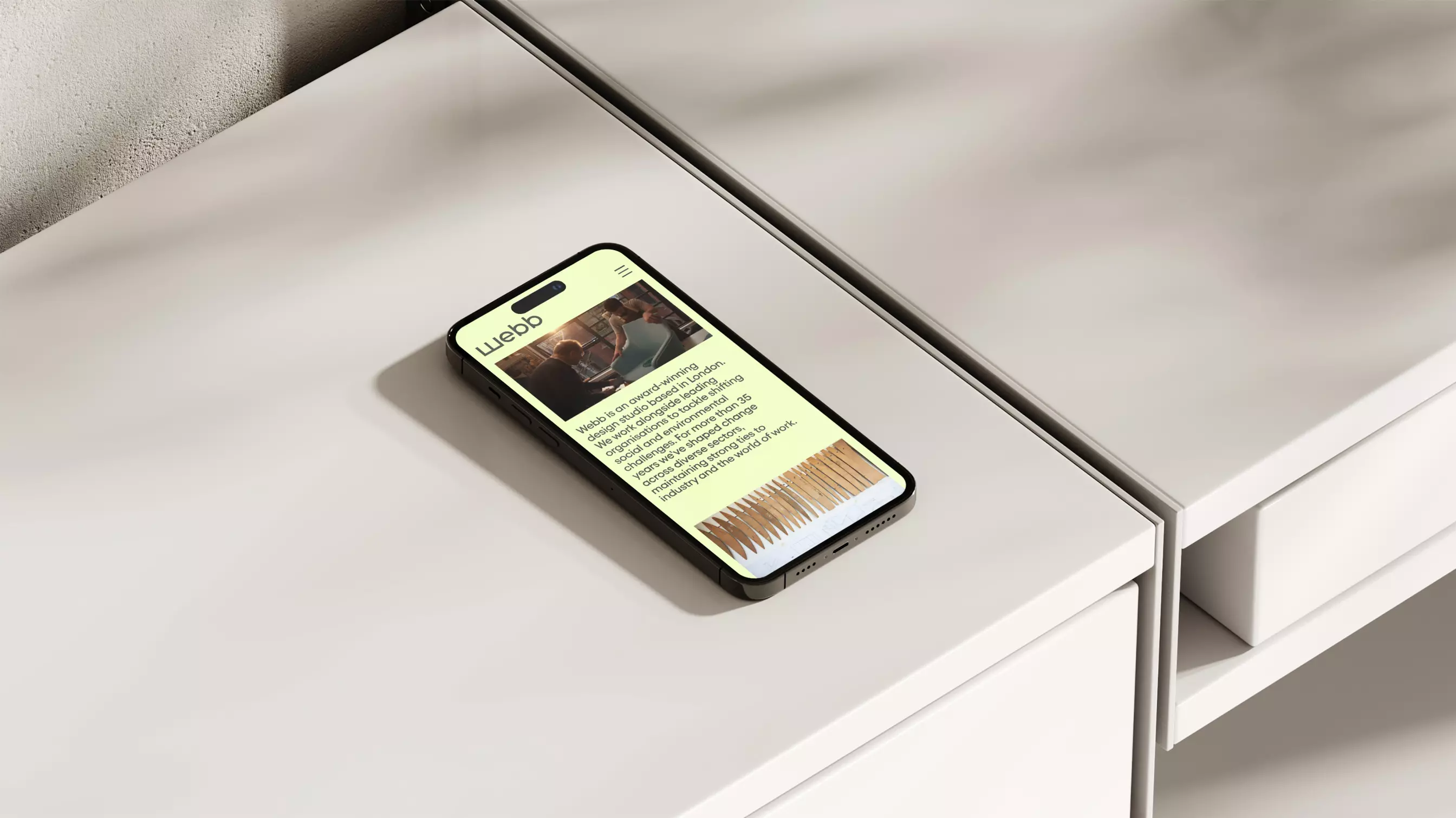
Creating a more intentional home for a fast-growing platform — with space to explore, contribute, and connect.
The Mother of All Lists had grown far beyond its original frame — evolving from a personal blog into a wide-reaching editorial platform. We designed and built a new site to support that shift: creating clearer structure, deeper pathways through content, and space for community contribution. The result is a platform that reflects the scale and intent of Clemmie Telford’s work — not just in how it looks, but in how it holds and organises what matters.
Overview
What began as a personal blog from writer and curator Clemmie Telford has become a generous, inclusive platform spanning mental health, parenting, identity, and the quiet complexities of modern life.
We were invited to redesign and rebuild the MOAL website at a pivotal point in its evolution. With Clemmie’s debut book underway and a growing readership, the site had outgrown its original structure. It needed to become the centre of gravity — not just housing content, but shaping a coherent and accessible experience around it.
The brief
The original MOAL site had grown steadily, but as its audience and purpose evolved, it became clear the platform needed a more deliberate framework and shape. A space that could carry the depth and breadth of its content while opening new ways for readers to engage.
Key requirements included:
– Optimising for mobile-first use, where most of the audience now engages
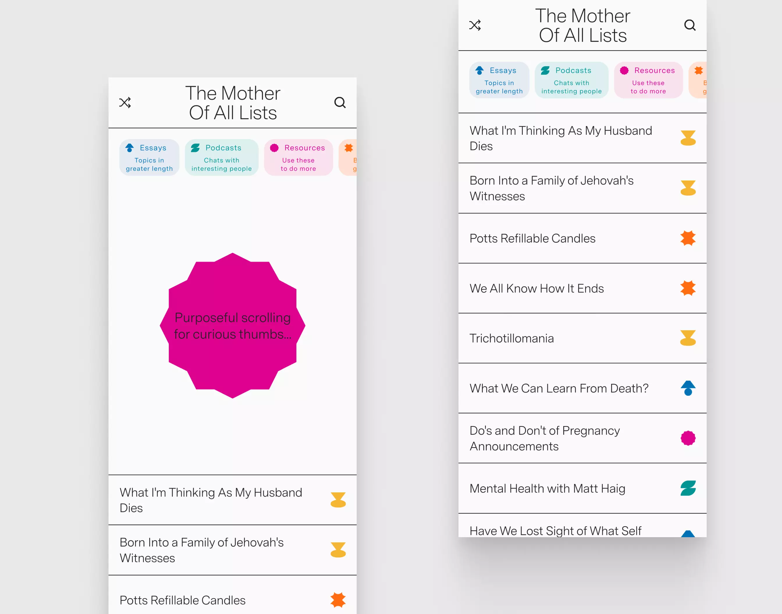
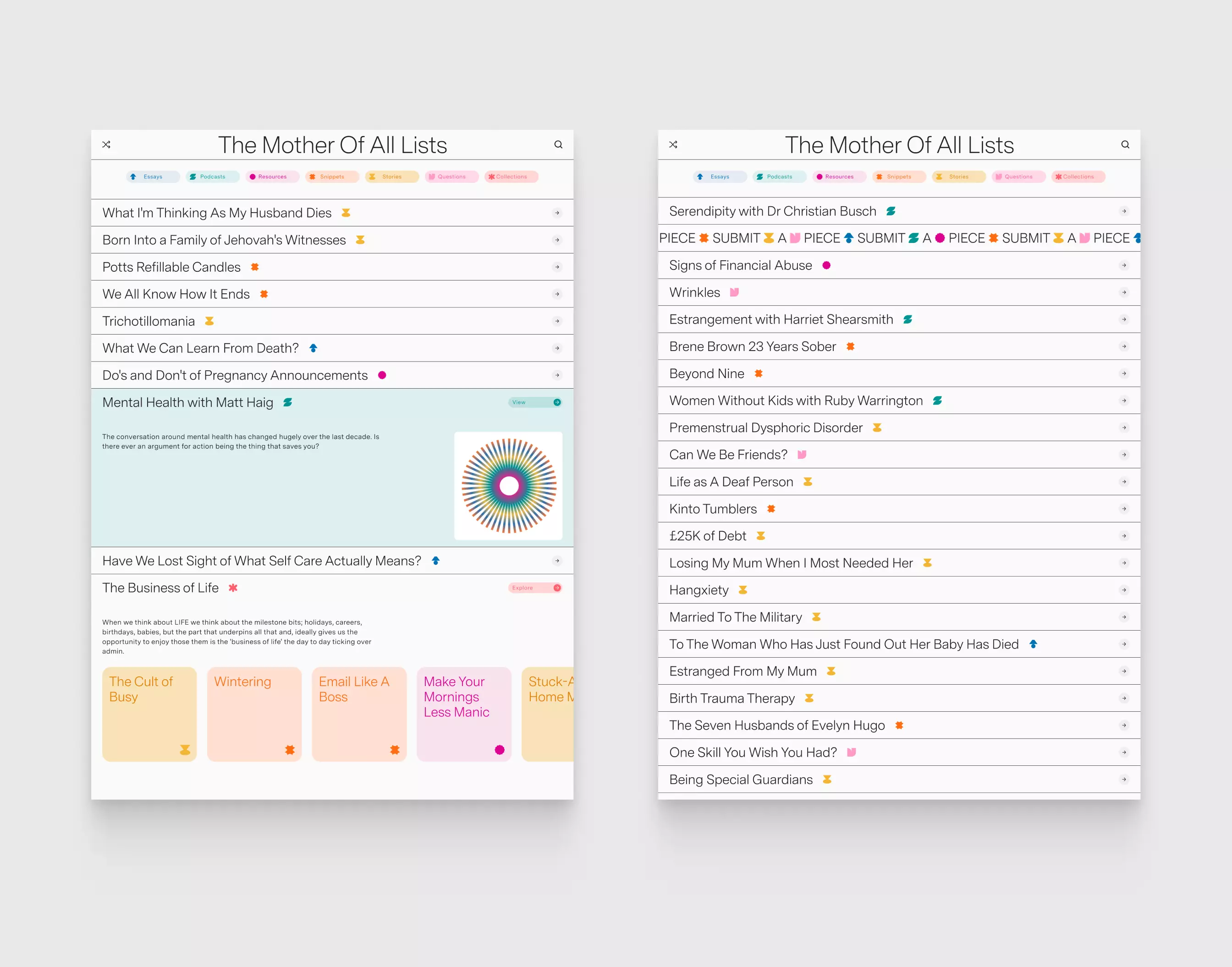
– Reworking the content model to allow for deeper categorisation and future growth
– Expressing the visual character of the brand in a way that felt bold but not exhausting
– Introducing a clear pathway for user submissions to support community participation
Importantly, the website was not a companion to the book — it needed to stand on its own, as the primary expression of MOAL’s evolving presence.
Our approach
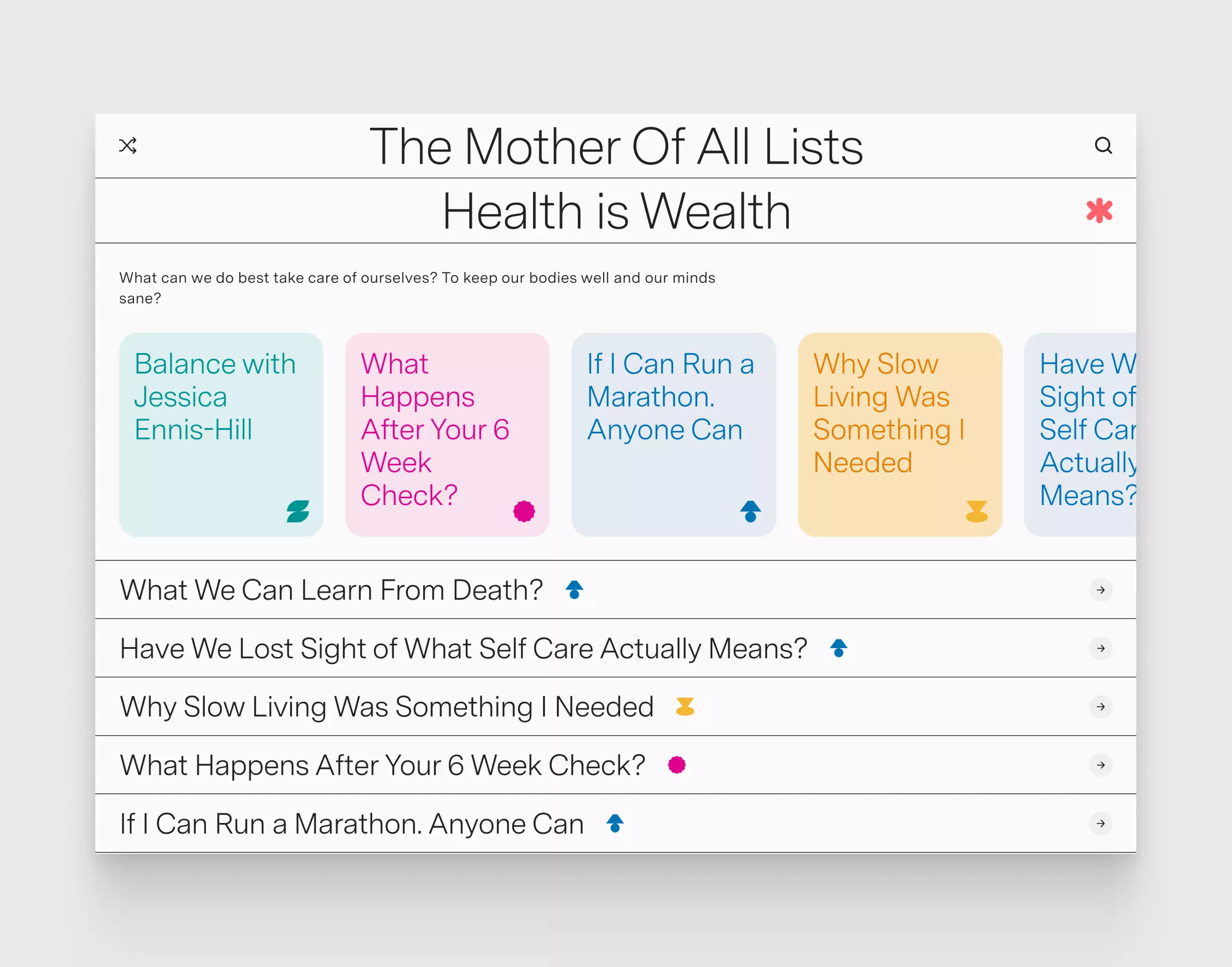
Rather than impose a fixed structure, we began by observing how the content wanted to behave. MOAL’s lists are varied and accessible — not overly polished, and all the more generous for it. That openness was important to retain.
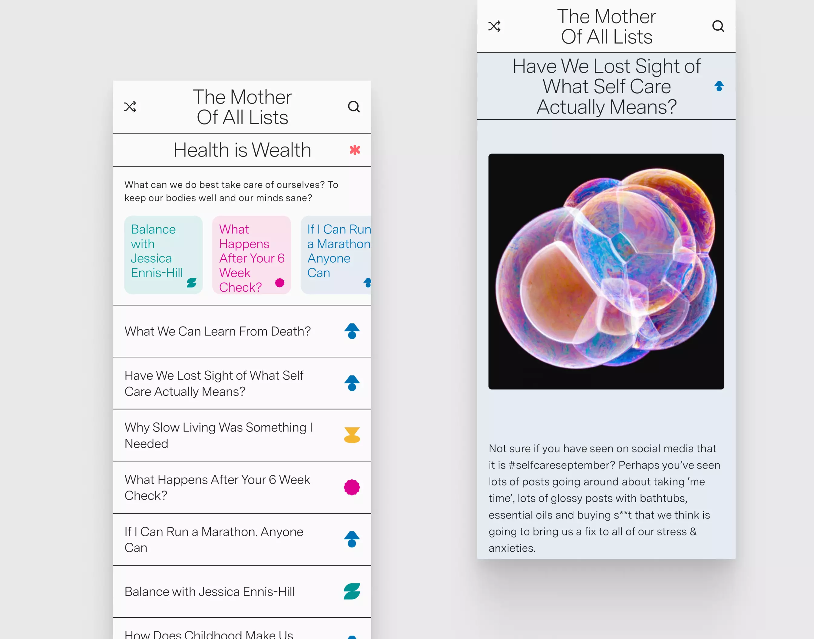
A new data model enabled richer cross-referencing and more flexible navigation, allowing readers to move fluidly between topics and themes. Endless scroll supports deeper exploration, and the mobile-first interface ensures content remains legible and inviting wherever it’s encountered.
The visual system was based on a style direction provided by Clemmie and her collaborators — strong, structured, and intentionally spacious. We focused on integrating this language into a web design that could support long-term growth and serve both readers and contributors. To that end, a streamlined submission system was also introduced, encouraging community members to add their own lists, insights, and reflections.
A platform built for longevity
Beyond design and structure, the site now lays a foundation for MOAL’s next chapter — not just editorially, but operationally. With a content model built for growth and an interface designed around real user behaviour, the site now functions as a more agile and expansive platform. It supports ongoing publication, enables community contribution, and creates new opportunities for partnership without requiring a complete rethink.